

UI UX Redesign Task
2020
UI/UX Design
Redesign Challenge
"Create a standalone version of the turntable feature that will, hypothetically, become a new app"
Project Brief
"Based upon customer research, some users think that it is hard to find the turntable feature, and have requested an easier and more direct access to outputting turntables. They would also like to have the option to choose to rotate the car or camera independently, rather than just the camera."
The Problem
From my initial impression of the turntable feature, whilst it already has an impressive suite of features, there are some features that can be added to improve the overall user experience for new and experienced users, such as additional user control features and user input values for more accurate measurements.
The Goal
We want users to jump into the programme and be able to create hi-fidelity turntables with ease, rather than spend their time navigating and understanding the programme's features and how it will affect their final render.
Imagine, if you will, you think of something great in your head to draw but once you try to replicate that vision on paper, it looks nothing like what you imagined. If we can provide users with the tools and information to aid their creativity, then that great idea they had in their head, can become a reality for them.
The main factors I wanted to focus on were:
-
Accessibility
-
User Confidence
-
Readability
The Solutions
Initial Concepts
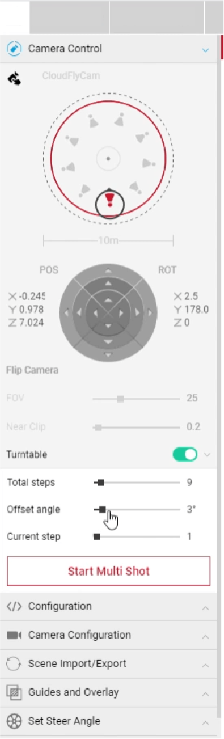
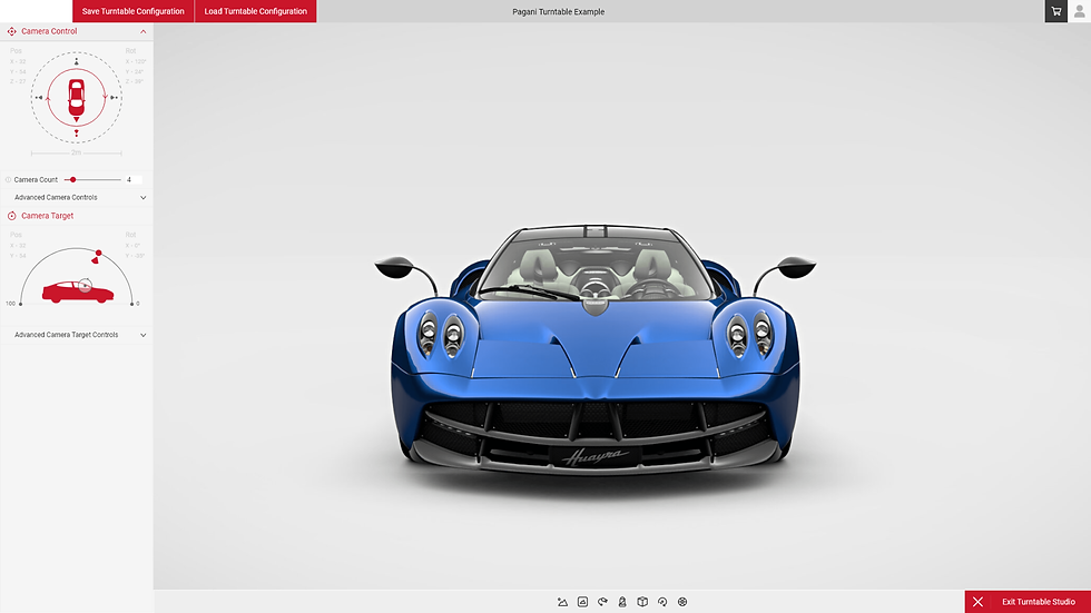
Looking at the current turntable features that are live, we can see how new users would find it quite overwhelming to understand and navigate. In this state, users have features available to them, but they have no information regarding what they do and how it affects their final render. This is mostly evident if we look at the POS (Position) and ROT (Rotation) camera control feature. New, or inexperienced users, may not know how to properly utilise this tool as the arrow key style navigation method seems convoluted. We want users to be able to fully understand how their input influences these camera controls, so changing the input method to something that is simple, easy to understand and customisable by user input is the best course of method. As the brief states, users have "requested an easier and more direct way of outputting turntables", so this justifies the simplification of the aforementioned camera controls.
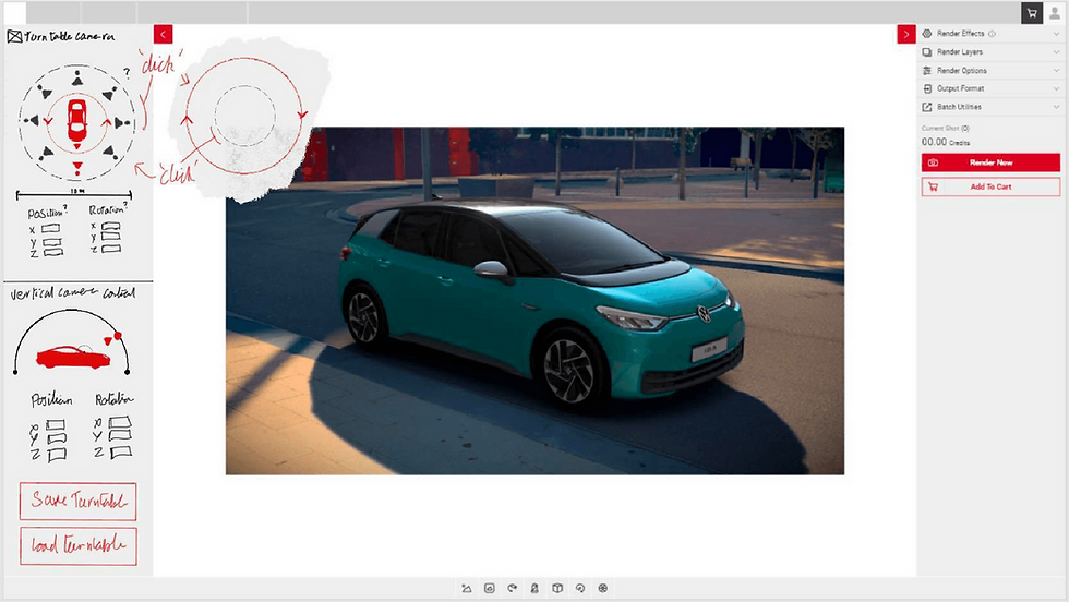
The proposed initial sketch designs solve this problem by replacing a majority of information with visual representations. For users who do want a fine-tuned experience that using visual inputs won't let them achieve, they can manually input their own data; which is collapsable in a sub-menu by default as to not overwhelm the user.
Again, with visual representations, large icons for the car and camera help the user understand where they are in relation to each other. Users are now able to turn both the car or camera by simply clicking on the camera control rig ring, this will swap which camera the user has control over. There are also preset camera angles for users who want to quickly output turntables.
Another addition in the redesign is the vertical camera control rig. This was missing from the current turntable programme and was something that was sought after by users. The vertical camera control adds an extra layer of customisation for the user, allowing them to utilise an extra axis to create more dynamic turntables. Again, this is represented by iconography, showing the camera in relation to the car, as well as a visual indicator to show where the camera is focusing.
With Marbleous being a casual game with a simple playstyle, there was not much urgency to have a great deal of onboarding, as the player would understand the overall gameplay loop within a few levels. Future onboarding would have been implemented as new pieces were introduced that required new interactions from the player, if Marbleous was to be released as a full standalone game.
With Marbleous having such a simple control scheme and the game consisting of only a few levels, I felt as though it wasn't necessary to have a control's menu for players to refer back to, instead, the controls are taught to the player in specific levels within the game space; simple game, simple UI. For example, in the first level, the player is taught how to move pieces. Making the words Click and Drag have a bold style compared to the rest of the text gives these words a higher sense of priority against the rest of the text, allowing the player to understand what interaction is needed without necessarily reading the entire text. These instructions persist through each level they are presented in, so if the player were to fail a level, the intructions will still be there on their next attempt.

